Address
Sweden,
Gothenburg


THE STARTING POINT
After years of working across different areas of marketing, I wanted to create space where I could share my professional experience, demonstrate my skill and offer my services.
But I didn’t want to create a portfolio website. I wanted to develop a brand that reflect how I see marketing, how I work and what I bring to a business.
That’s how M-Marketing started.
FINDING THE POSITIONING: MARKETING, AS A WHOLE.
Throughout my career, I’ve gained experience in many different areas of marketing, from brand development and digital communication to campaigns, product launches and events.
I’ve always enjoyed this variety. I like switching between creative and analytical tasks, exploring different tools and being involved in different stages of the marketing process. I enjoy seeing how different parts of marketing connect and contribute to a bigger picture.
That became the foundation of M-Marketing and its central idea: Marketing, as a whole.
FROM POSITIONING TO VISUAL IDENTITY.
Once I had defined the positioning, the next challenge was translating it into a visual identity.
The letter M was a natural starting point. It stands for Marketing and, coincidentally, is also the first letter of my name.
I wanted to give it another layer of meaning, connecting it to the idea of marketing as a whole.
The inspiration came from the concept of the marketing mix – a framework describing the key elements businesses combine to bring their products or services to market.
In 1960, Professor E. Jerome McCarthy introduced the well-known 4Ps model: Product, Price, Place and Promotion. Together, these elements form a foundation for developing a coordinated marketing approach.
Over time, marketing theory has evolved, and additional elements and frameworks have emerged. However, I chose the original 4Ps as the foundation of my logo.
For me, they represent an idea I strongly believe in: marketing works best when its different elements are connected rather than treated as separate activities.
That thinking shaped the M-Marketing logo: four individual pieces coming together to form one letter M.
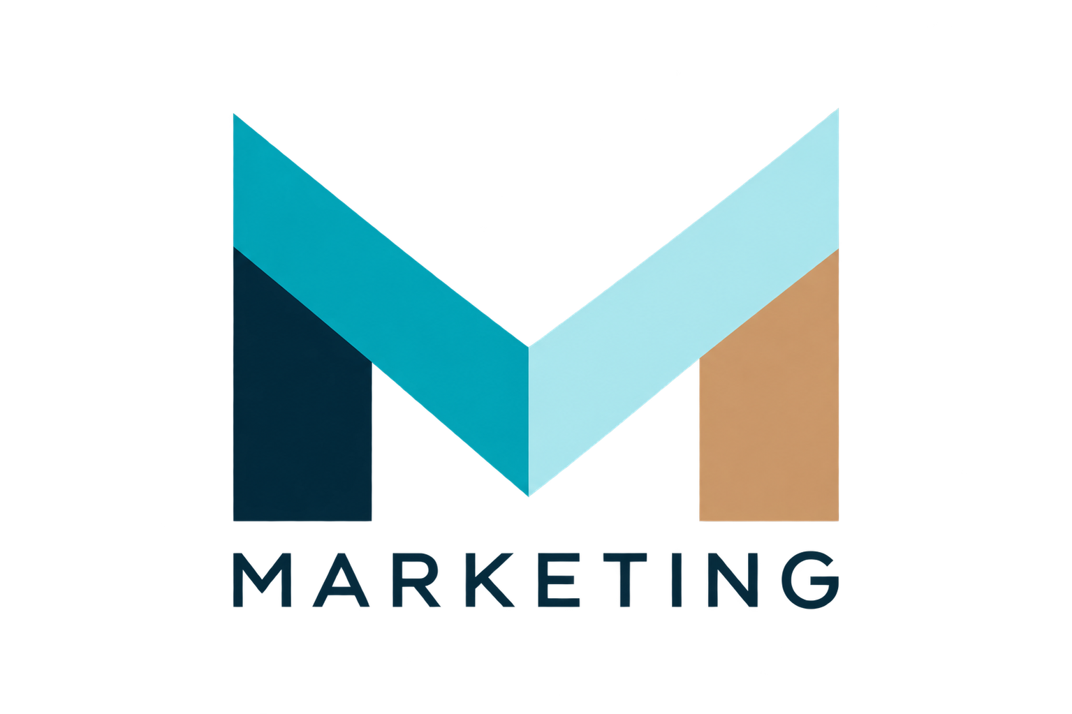
The same approach guided the development of the visual identity. I wanted something modern, structured and distinctive, with enough flexibility to work across different formats and communication channels.
Architecture became an important part of the visual direction. I was drawn to its geometric forms, clean lines and the way individual elements come together to create something bigger. For me, architecture reflects many of the qualities I wanted M-Marketing to communicate: structure, reliability and connection.
It also gave me a visual language that felt consistent with the idea behind the brand – different elements working together as a whole.
COLOUR AS A PART OF BRAND COMMUNICATION
For me, colour is much more than an aesthetic choice. It’s one of the ways a brand communicates its personality, values and the associations it wants to create.
When developing the M-Marketing palette, I wanted to communicate reliability and structure while keeping the identity modern and approachable.
I chose deep navy to create a sense of stability and professionalism, turquoise to bring freshness and energy, and warm white to keep the overall look balanced and welcoming.
Together, these colours reflect how I want M-Marketing to be perceived: dependable, structured and creative.
A BRAND OF MY OWN
Working on M-Marketing gave me an opportunity to approach brand development from a different perspective – this time, with myself as the client.
It was an interesting challenge to turn my experience, ideas and preferences into a clear brand identity.
M-Marketing has its foundation, but like any brand, it will continue to evolve. Markets change, customer expectations shift, and new opportunities emerge. A strong brand needs a clear identity while remaining flexible enough to adapt to change and stay relevant over time.